
TALK5 Mobile App Design
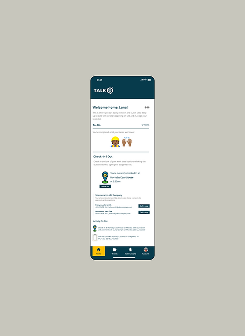
To empower workers to quickly and easily understand the risks of their work and onsite, a "happy path" within the worker mobile app was designed in 3 days.
The Unique Problem to Solve
A disjointed experience
The existing app lacked a sense of cohesiveness with features only being built to 80-90% completion. It was also not entirely fit-for-purpose when considering the main tasks were assessing risks and checking in and out of sites.
Lack of a feedback loop
The existing solution currently lacked enough notifications to incentivise users to come back into the app.
No free experience
Previously Talk 5 could only be used by the “worker” persona when the organisation has purchased a subscription, i.e. users could not experience Talk 5 without paying. This limits people who may need the technology most from being able to access it.
Preparation
To kick off preparations, I reviewed the current mobile designs to assess what works and provides a good customer experience, what fails to meet customer expectations and/or needs and what is really frustrating for the customer.
I also reviewed existing documentation such as rebranded materials, brand guidelines, design system, briefs, and flowcharts.
As a final step, I facilitated a white-boarding session with the CEO and Group Design Director on Miro to confirm the scope of work and align on expectations on what to include in the mobile app and demo.

My Approach
Once I was familiar with the new branding, design system and scope of features to design into the worker mobile app, I started developing designs of what a “happy path” (the ideal, intended flow through the application that achieves the users’ tasks) would look and feel like.

Rapid reviews and iterations took place to evolve the designs to a point where they were ready to be presented to and critiqued by the developers and other teams across the organisation.
All of the feedback given during the demos was collected and documented to handover to the Design Director to continue the future iterations of the worker app (I was asked to shift my focus to the third design sprint: the website refresh
Challenges to navigate
Tight timelines
The extremely short turnaround of 3 days meant that designs were rushed and didn't consider all variables or paths a user may wish to take.
Lack of user research
No user research was afforded in order to seek a comprehensive understanding of the various jobs to be done, tasks and needs of the worker/user archetypes.
What I'd do differently if given the chance
Improvements to visual formatting and content
If I had the time to iterate on this further, I would’ve loved to have brought down the text to a minimum, increase the size of the text and use much more visual communication to guide the user through the platform.
Optimise the homepage
In future iterations, I’d also reconfigure the layout of the homepage to look less busy and focus on the most important tasks for the user (this would be based on testing with real and prospective users).
Test, test, test
I’d also love to conduct multiple rounds of customer research to sense check the designs with the people who’d need it’s functionality the most: low-literacy and/or migrant workers.