
TALK5 Website Redesign
To support the relaunch of the TALK5 platform and rebrand, a radically refreshed website was designed with the vision of inspiring businesses to use a platform that puts their workers first.
The Unique Problem to Solve
Disruption of the health and safety industry
TALK5 were in a position to disrupt the health and safety industry through innovative technologies within a compact omni-channel platform, however they lacked the market awareness and positioning to make this a reality.
Thus, I was brought on to support the business to tell their story in a way that reflects the humanness of their mission and approach while maintaining a level of professionalism that clients seek when dealing with the most important thing, people’s lives.
Preparation
In order to ensure I was telling the right story, the right way, I spent time with the team to understand what was important to convey both on a conceptual and functional level.
I reviewed the current website designs and assessed what works well and what could be improved.
I also conducted a comprehensive state assessment of the market to understand the best in class of web design as well as a robust competitor analysis in order to ensure TALK5 clearly stood out from the rest.
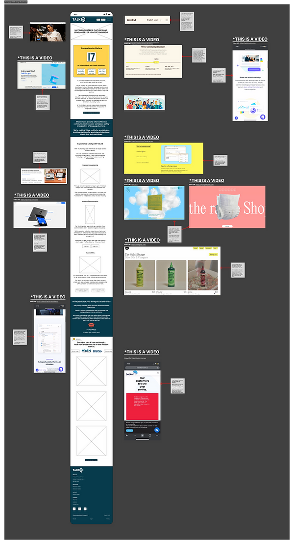
During the first iterations of wireframing, I created a mood board within Figma to showcase the visual storytelling and motifs that I envisioned for the various website pages.

My Approach
Given most people use their mobile devices to do initial research, I focused on designing the wireframes for iOS mobile devices first. This also sped up the process of building out the designs across multiple devices through ease of expanding designs out, rather than bringing them back in.
By focusing on mobile-first, I was also able to flex the creativity around the designs to build in more interactive elements and convey the story in an engaging way.
While building out the designs, I updated the mood boards and wireframes to include annotations so that the Design Director, CEO and Product Director could be brought along the design journey more effectively.
I took an iterative approach to designing the webpages and ensured that I booked in review and design crit sessions with the Design and Product Directors to get timely feedback and build in opportunities to pivot to keep designs inline with their vision.
Once the mobile designs were iterated to the point of alignment across myself, the Design and Product Directors, I adapted these to be desktop responsive and developed them to hi-fidelity (pending final visual content from the product manager).
Challenges to navigate
Misalignment around vision
During the design sprint, there was a misalignment and miscommunication around the tone of voice, content format (written vs visual content) and vision.
To resolve this misalignment, I organised a team health / alignment meeting with the Design Director and Product Director. Here I used a template I made within FigJam to get each of us to note down our perspectives for topics around Tone of Voice, desired outcomes, vision and other relevant points.

What I'd do differently if given the chance
Not always mobile-first
Although in most scenarios, it is recommended to build mobile-responsive designs first, in this case the team felt challenged in understanding the holistic design and flow for the target market of the website without the designs being in desktop format.
Thus in the future, I would take greater consideration of who would likely be viewing the website and for what purpose so I could start designing for the right channel and device.